top of page


Red Carpet Theaters
A movie theater / Snack and Beverage App
Market research
Competitive analysis
Persona
Flow diagram
Wireframe
Low-fidelity UI
High-fidelity UI
Accessibility evaluation
Where:
Long Island, New York
What:
Native Mobile App (iOS)
Why:
Portfolio Project
Role:
Designer, Researcher
Category:
Theaters App
When:
July 2023
Why I made this project:
This project is a redo of one projects I did for the google UX certificate a year back. I wanted to redo this project to see how much I have grown and improved as a designer.
Market Research
The claim:
In 2022 the global movie theater market size was 76.6 Billion dollars. By 2032 it is projected to reach around 100 Billion dollars. There is an anticipated CAGR (compound annul growth rate) of 4.9% over the next decade
The problem:
The COVID-19 global pandemic greatly hurt the movie industry decreasing theater attedance dramatically

Competitive analysis
I analyzed 3 other popular movie theater apps comparing their ordering experience and reviews on the app store to find patterns

AMC

Regal

Fandango
Pros:
The app was quick, easy, and convenient to use, Everything is integrated well and it’s easy to check my tickets (AMC), User Friendly keeps track lets you use reward points (Regal) I enjoyed reward points (Fandango),
Cons:
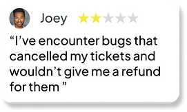
Technical issues causing canceling tickets and making refunds not work (AMC), Subscription service was hard to cancel (Regal), App was unstable and didn’t always work (Fandango),
Problems mentioned in the comments:

.png)

Initial Research shows:
Mobile apps for movie theaters can be convenient ways for users to buy movie tickets; however unstable apps can lead to frustrating experiences
Personas
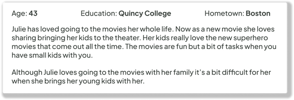
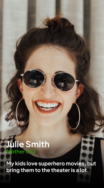
I created two personas based on different types of movie goes; a young adult, and a mother of young children.
.png)


Time to start designing!
After reviewing the research data, it was time to sketch out the first flows and then make the initial low-fidelity wireframes
Flow Diagram
To outline all the necessary functionality I created a simple flow diagram of the main tasks users would within the app.
Main task flow
.png)
Low-Fidelity wireframe

After establishing the user flow, I created the low-fidelity wireframe of the main user tasks
Design System
Once the main user flow was completed, I started planning out color palette and fonts for the app
Color Palette:
Primary, Secondary, Accent
0E0606
FFFFFF
FE0620
Tertiary Colors
CCCCCC
333BFF
60 - 30 - 10 Palette
This project followed the 60-30-10% rule for its color palette. 60% of app is black (all the background or empty space). 30% of the app is white (all the text, icons or other elements). The last 10% of the app is red the accent color (key elements to be highlighted).
Additional tertiary colors were used too for less important elements.
Font:
Plus Jakarta Sans
Sizes:
12, 16, 20
Medium, Bold
Icon Set:
Material Design Icons
.png)
.png)
.png)
Alignment and grid
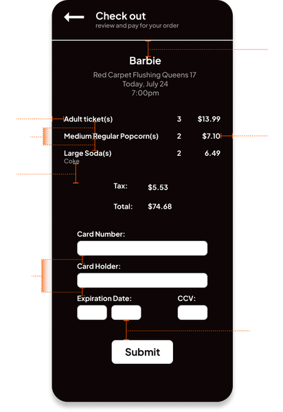
I picked an 8-point grid for the project and set the side margins for 24 points. I spaced all the elements apart based on the 8 point grid for a consistent look.
High-fidelity UI
The low fidelity screens were used as a base to refine and turned into high fidelity screens.
.png)


.png)


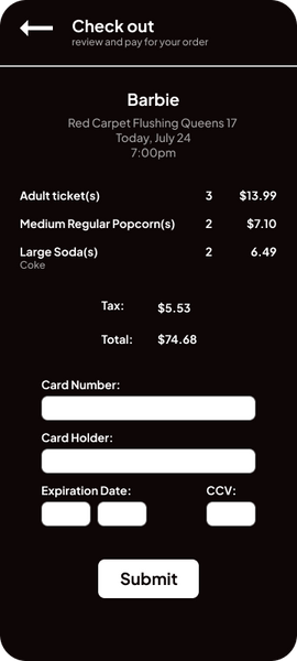


Accessibility check
The contrast ratios for the primary colors used in the design were checked to see that they passed the WCAG AA test. This is so that different element contrast each other enough that they are easily visible to all.
.png)
Project Summary
For this project I did market research on the movie industry, then created a competitive analysis of similar apps. Created personas based on the two main movie goer demographics. I created a flow diagram to plan out the how the app would work. Created a wireframe, then low and high fidelity UI. Then evaluated the accessibility of the UI’s contrast.
I originally created the movie app roughly a year prior as part of the google UX certificate. I was happy with my design then but I knew I could do better. I reattempted this project to see how far I had come as a designer. I think the results look a lot more professional and better overall; I’m happy with the outcome but I know there’s still more room to grow.

bottom of page